In today’s data-driven world, compelling data visualisations are more than just pretty charts—they’re powerful tools for communication. Whether you’re presenting insights to stakeholders or designing dashboards for end-users, two principles are key: visual hierarchy and colour psychology. When used thoughtfully, these elements transform complex data into clear, impactful stories. Here’s why they matter and how to leverage them.
Visual Hierarchy: Guiding the Eye with Purpose
Visual hierarchy guides the viewer’s attention intuitively by organising elements in a way that helps in filtering out key information with ease. In data visualisations, it’s about prioritising information to make insights accessible at a glance. Without a clear hierarchy, viewers can feel overwhelmed, thereby missing the key takeaways that are often buried in a sea of numbers or shapes.
Start by categorising the most critical data point or insight. Use it to create an effective hierarchy. Emphasise colour through size, position, or contrast to make a strong impact. For example, place a large, bold number at the top of a dashboard to instantly draw attention. Keep supporting metrics smaller and lower down. Use whitespace to separate elements and avoid clutter. This gives your data room to breathe. Group related data points together, such as placing KPIs in one panel. This helps viewers process information logically.
Colour Psychology: Conjuring Emotion and Clarity
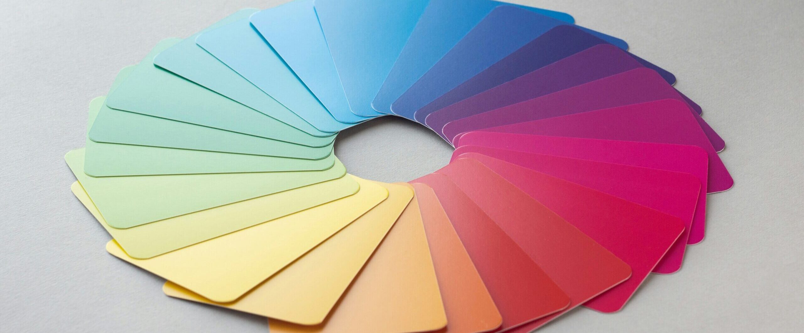
Colour carries emotional weight and cultural associations. It’s not just aesthetics; it’s a psychological tool that influences how people interpret data. For example, blue conveys trust and stability, making it ideal for financial dashboards. Red signals urgency or alerts, perfect for highlighting declines or risks. Green often represents growth or success, aligning with positive metrics. Keep in mind if you overuse or make poor colour choices, it’s likely to backfire. Too many colours create chaos, while poorly contrasted hues can strain the eyes or obscure data.
Bonus tips:
Stick to a limited palette of a maximum of three to four colours.
Also, ensure high contrast for accessibility.
Use colour to reinforce meaning. For example, in a sales performance chart, use green consistently for regions that exceed targets and red for those that fall short. Color coding creates a beautiful and spontaneous link between colours and outcomes, thereby reducing the cognitive load on the viewer.
Bringing It Together
With the right combination of visual hierarchy and colour psychology, you can create visualisations that are not only clear but also engaging. A well-designed chart or dashboard tells a story, guiding viewers effortlessly from the big picture to the details. It respects their time and cognitive capacity while evoking the right emotions to drive action.
Next time you’re crafting a visualisation, ask yourself: Does the current hierarchy make the key insights obvious? Do the colours align with the data’s emotional tone?
By mastering these principles, you can turn raw data into compelling narratives that resonate with your target audience.
Visual hierarchy is the arrangement of visual elements to guide viewers toward the most important information first. It uses size, position, contrast, and spacing to improve understanding.
Colour psychology influences how users perceive and interpret information. Strategic colour choices can highlight trends, reinforce meaning, and improve decision-making.
A limited palette of three to four colours is generally recommended to maintain clarity, reduce visual clutter, and create consistency.
Visual hierarchy helps users quickly identify key metrics and insights, reducing cognitive load and making dashboards easier to navigate.
Blue is often associated with trust and stability, green with growth and success, and red with warnings or declining performance. The best choice depends on the context and audience.
Consistent colour coding helps viewers understand patterns and outcomes more quickly, making data stories more engaging and easier to follow.
Common mistakes include using too many colours, poor contrast, cluttered layouts, inconsistent colour coding, and failing to establish a clear visual hierarchy.
Visual hierarchy directs attention to key insights, while colour psychology reinforces meaning and emotional context, creating more effective and engaging visualisations.