Interpret data effectively to make better decisions in today’s data-driven world. Whether you’re a student, professional, or business leader, learning how to interpret data is an essential skill for uncovering insights, solving problems, and making informed decisions. Whether you’re looking to improve decision-making, uncover hidden patterns, or simply make sense of the numbers, interpreting data correctly is a powerful skill that opens the door to deeper insights and new opportunities.
Learning to interpret data isn’t just about understanding numbers—it’s about asking the right questions and making informed decisions.
How to Interpret Data Effectively
1. Context matters the most
Before you interpret data, take a moment to understand the context. Context is one of the foundations of data storytelling because every dataset tells a story. Ask yourself: What question or problem is this data trying to solve? Where does the data come from? Why are you doing this exercise? By asking these questions, you can better understand the context of the data which will help you frame your analysis and avoid misinterpretation.
2. Know Your Data Types
Once you’ve understood the context, it’s time to analyze the data more deeply. This is where understanding data types plays a crucial role.Data can take many forms, such as quantitative, qualitative, and time series. The OECD Data Explorer demonstrates how different data types are used to analyse global economic and social trends. Before extorting findings from any data, knowing whether the number at hand or the values you are dealing with are rankings, percentages or frequencies, is crucial. This understanding will help you choose the correct analysis technique.
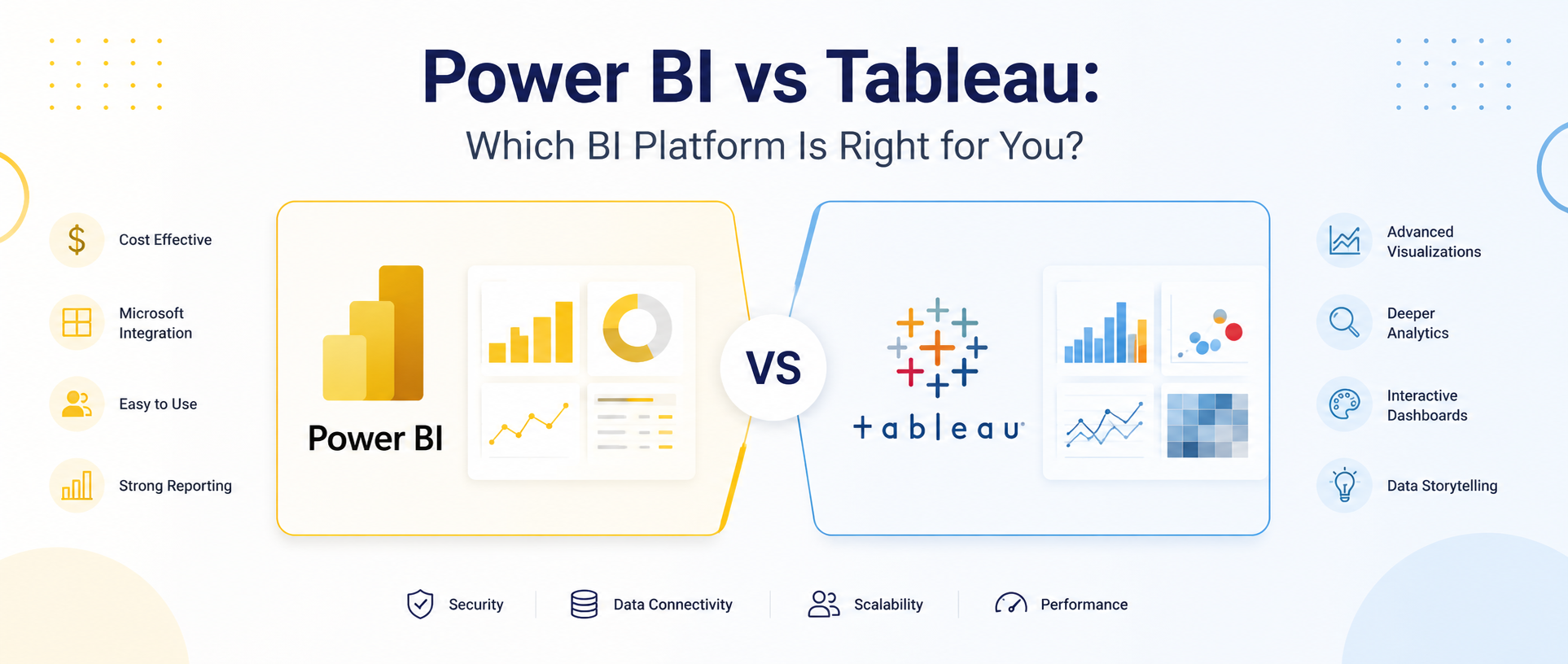
3. Use Visualisations
Visual tools like charts, graphs, and dashboards make it much easier to interpret data than relying on tables and raw numbers alone. Applying visual hierarchy and colour psychology helps communicate insights more effectively. Pie charts work well for proportions, line graphs show trends over time, and scatter plots reveal relationships between variables. Leverage tools like Excel, Tableau, or Power BI. Microsoft’s guide to data visualisation best practices provides useful principles for creating clear and effective dashboards.
4. Spot Trends and Patterns
Once the data has been visualised, look for recurring patterns or noticeable trends. Is there a stable upsurge or decline? Is the data showing any seasonal spike? Understanding these patterns and recognising seasonality helps you draw meaningful insights.
5. Beware of Bias and Errors
Data is not always perfect. Developing good data quality practices helps reduce errors before analysis begins. Be aware of potential biases or errors in data collection, sampling, or reporting. Ask critical questions like: Are there any missing values? Is the sample size suitable? A thorough review helps identify and question findings before they are presented to the stakeholders; hence, it becomes a helpful hand in examining whether the conclusions drawn are reliable.
6. Simplify Complex Findings
Now that you understand your data and can interpret it, the process isn’t over. The most important work starts here: explaining your findings to others. Try to use easy-to-understand graphics and simple language to communicate your insights. Avoid jargon and keep your focus on the key takeaways.
7. Practice Regularly
Practice is the key to mastering any skill. Data interpretation is no different-it improves with regular practice. Start with handling small datasets and, with time, gradually work your way up to more complex ones. Multiple online sites are available where numerous datasets are freely accessible, such as government databases and public surveys. You can take data set from there to polish your skills.
The key takeaway for learning this skill is regular practice; the more you practice, the more confident you’ll become in analyzing data and making informed decisions.
Remember, every dataset has a story behind the numbers. Learning data interpretation and understanding concepts like averages, trends, and outliers will help you uncover it.
Interpreting data means analysing information to identify patterns, trends, and insights that support informed decision-making. It involves understanding the context behind the data rather than simply looking at numbers or charts.
Data interpretation helps individuals and organisations make informed decisions based on evidence rather than assumptions. By understanding what data is communicating, businesses can identify opportunities, solve problems, and improve performance.
You can improve your data interpretation skills by understanding the context of the data, learning different data types, using data visualisations, identifying trends and outliers, questioning potential biases, and practising with real-world datasets regularly.
Context explains what the data represents, where it comes from, and the problem it is trying to solve. Without context, even accurate data can be misunderstood, leading to incorrect conclusions and poor decision-making.
Data visualisations such as charts, graphs, and dashboards make complex information easier to understand. They help reveal trends, relationships, and patterns that may be difficult to identify in raw tables of data.
Some common mistakes include ignoring context, relying on misleading averages, overlooking outliers, failing to check data quality, misreading visualisations, and drawing conclusions without considering the full dataset.
Trends and patterns can be identified by analysing changes over time, comparing categories, recognising recurring behaviours, and using visualisations such as line charts, bar charts, and scatter plots to highlight relationships within the data.
Bias and errors can distort analysis and lead to inaccurate conclusions. Reviewing data sources, sample sizes, missing values, and collection methods helps ensure the insights you generate are reliable and trustworthy.