Interactive digital documentation is rapidly becoming the new standard for modern reporting. As organisations generate larger volumes of data, traditional methods such as static PDFs and bulky spreadsheets are no longer sufficient for communicating insights effectively. Interactive digital reports enable users to explore information dynamically, making data easier to understand, analyse, and act upon. This shift represents more than a technological upgrade—it is a strategic investment in better communication and smarter decision-making.
The Power of Interactivity
Interactive digital documentation surpasses the limitations of traditional formats by making reports more accessible and engaging. This approach complements effective data visualisation, helping users explore information more intuitively rather than simply consuming static reports. Unlike static reports that must be read in a fixed order and often require cumbersome scrolling, interactive tools allow users to explore data freely with features such as clickable dashboards, detailed charts, and real-time filters. This allows users to explore the data in greater depth, tailoring their analysis to meet specific objectives or information needs. For example, a company executive can quickly switch from overall performance figures to detailed regional results with just one click, making it easier to make decisions.
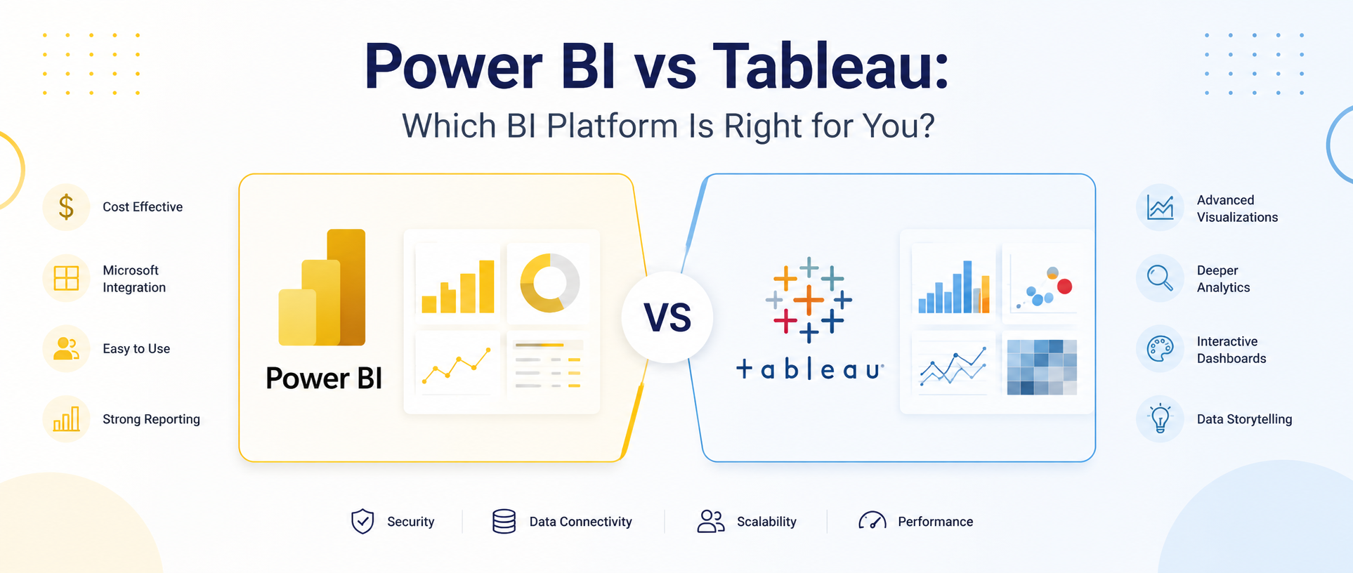
This flexibility is made possible by modern technologies, such as JavaScript and cloud-based analytics. Tools such as Tableau, Power BI, and custom web applications allow users to incorporate videos, animations, and live data, making the reports more informative and engaging. This not only improves overall readability and visual experience but also supports better decision-making by allowing users to interact directly with the underlying data.
Precision and Accessibility
For an informed audience, the lexical sophistication of interactive documentation lies in its ability to distil complexity without compromising on depth. Natural language processing (NLP) integrations can generate narrative summaries alongside visuals, applying many of the principles of data storytelling to make complex insights easier to understand. This combination of visuals and narratives reflects effective data storytelling, helping audiences understand not only what happened but why it matters. Meanwhile, accessibility features—such as screen-reader compatibility and high-contrast modes—ensure inclusivity that aligns with WCAG standards. Moreover, interactive reporting mitigates the risk of misinterpretation inherent in static documents.By allowing users to filter, explore, and see details behind the numbers, interactive reports reduce the risk of misinterpretation and help avoid many common data visualisation mistakes.
Furthermore, real-time updates eliminate the lag between data collection and dissemination, ensuring that stakeholders engage with the most up-to-date insights. For example, a supply chain manager can monitor inventory levels in real-time, adjusting strategies instantly to avert disruptions.
The Strategic Imperative
A broader cultural transformation is evident with the shift to interactive digital documentation. Organisations are embracing this approach to demonstrate agility and foresight while building stronger data literacy across their teams. It’s a competitive differentiator—clients, partners, and internal teams expect intuitive, responsive tools that respect their time and intelligence. To implement this effectively, start with user-centric design: map user journeys to identify key interaction points. Leverage modular frameworks to ensure scalability and maintainability. And don’t overlook governance—robust data security and version control are non-negotiable to preserve trust.
A New Period
Interactive digital documentation and reporting herald a new beginning, where data becomes a living, breathing entity rather than a static artefact. With the perfect blend of interaction, precision, and accessibility, organisations can now craft compelling narratives that resonate with sophisticated audiences. Even at the government level, the use of interactive digital documentation has become a pressing need.
To gain hands-on experience with how interactive and digital documentation can be a new beginning for organisations, check out the recently released pre-election dashboard by Western Bay of Plenty District Council (WBOPDC) developed in collaboration with Data n Dashboards. Let us know your thoughts on this shift.
Organisations looking to maximise the value of interactive reporting should also invest in learning how to interpret data for better decision-making, ensuring that interactive dashboards translate into meaningful business outcomes.
Let’s get in touch to discuss how we can collaborate on your next project to help you leverage the power of interactive reporting.
Interactive digital documentation is a modern approach to presenting information that enables users to explore reports through dashboards, filters, clickable charts, multimedia, and real-time data. Unlike static documents, it provides a more engaging and user-friendly way to access and understand information.
Traditional reports, such as PDFs and spreadsheets, present information in a fixed format. Interactive digital documentation allows users to navigate content dynamically, filter data, drill down into specific insights, and personalise their experience based on their information needs.
Interactive digital reporting improves user engagement, enhances accessibility, simplifies complex information, supports real-time updates, and enables faster, data-driven decision-making. It also allows organisations to communicate insights more effectively through interactive dashboards and visualisations.
Interactive digital reports help users explore data from different perspectives using filters, drill-down features, and live dashboards. This added context reduces the risk of misinterpretation and enables stakeholders to make more informed and timely decisions.
As data becomes more complex, organisations need reporting solutions that are flexible, accessible, and easy to understand. Interactive digital documentation helps improve collaboration, increases stakeholder engagement, and provides up-to-date insights that support better business outcomes.
Interactive digital reports are commonly developed using business intelligence and web technologies such as Tableau, Microsoft Power BI, JavaScript frameworks, cloud-based analytics platforms, and custom web applications that support interactive dashboards and live data integration.
Interactive digital documentation can include accessibility features such as screen-reader compatibility, keyboard navigation, high-contrast themes, responsive layouts, and clear visual hierarchies. These features make reports easier to use for a wider range of audiences while supporting accessibility standards.
Organisations should focus on user-centred design, data security, scalability, version control, and accessibility when implementing interactive digital documentation. Ensuring that reports are intuitive, interactive, and aligned with user needs helps maximise their value and long-term effectiveness.